0 Cart
Added to Cart
    You have items in your cart
    You have 1 item in your cart
    Total
    Check Out Continue Shopping

    Painting Tutorials

    New Toys, New Beginnings

    New Toys, New Beginnings

                CanCon is a great gaming event, held in Canberra, ACT every Australia Day long weekend, visited by hundreds of gaming enthusiasts from all over Australia.  For me this year was different to other years as I hadn’t committed to 3 days of hardcore gaming and had the opportunity to wander around the tables in my own time.  A heap of different gaming systems on offer from Bolt Action, Infinity, Malifaux, Bloodbowl, Warhammer 40k and a myriad of historical games in various scales.  However, this story starts when I found the Guild Ball event and Geelong, Victoria’s own local Pundit and owner of Freecity Games, Jesse.

    I played Guild Ball when it came out, jumped in with the Alchemists guild, collected and painted the entire Alchemist catalogue at the time…., up to Crucible I think. I was even able to find some time to play some games with Jesse, who as always is keen to increase the following of Guild Ball in our area.  However, the ever-oppressing work, family and general time commitments for games amongst my other interests, Guild Ball slipped through the cracks… There are only so many games which I can maintain during my free time. So, reluctantly, I sold off my Alchemists but continued to follow the game as an interested third party and but not actively playing or collecting.

    Anyways… history is history… and we come to the present… 

    Catching up with Jesse and seeing some Guild Ball being played in the flesh, has rekindled my interest and hence has provided me this opportunity to write a painting article for Free City Games.  I’ve been tasked in providing the Free City Games readership with a painting blog for the Old Father Harvest box which I have picked about a month ago up to fire-up my Guild Ball mojo.  The Farmers are the relatively new kids on the block for Guildball, in particular “Old man” Thresher …  I was immediately taken by the name of his Don’t Fear the… character play with reminded me of the 1976 song by the Blue Oyster Cult, Don’t Fear the Reaper.

    This is the first time I had seen, “in the flesh…”  the new pre-moulded plastics.  I must admit that initially I was a little disappointed to hear that Steamforged Games was heading down this path, as I had loved their metal and resin range.  However, now seeing them in the flesh, the detail is still quite amazing, and the poses great. (I’m secretly looking forward to not having the superglue stick my fingers together!)

    Disclaimer!  Like many, I’m an amateur painter, winner of no amazing painting awards, I have a quick and effective method of painting which looks good on the table.  I claim to be no expert, and painting is one of those things where the effort you invest is returned in your results, in other words, you get back what you put in.


    The mini’s themselves required little, if any, pre-work, some small mould-lines which were easy to file/scrape back.

    I primed the models in white using White Knight Squirts (Matte) which is a local cheap enamel spray primer for about $7 from Bunnings.  I’ve used it for ages and have had no issue with it, some people prefer the reliability of the GW or Army Painter brands, but cheap is good for me, particularly if it works well and Squirts has been for me.

    Thresher, Fallow, Millstone, Ploughman and Tater

    I started by painting faces first and any skin areas and the shading in the darker recesses, with AV Vallejo German Grey (995), a Flames of War range paint.


    Once I had finished blacking in the shaded areas, I started to lay down the base colours.

    I tend to go with a limited palette with most of my projects.  For me this allows me to easily come back and complete projects and not forget which colours I use… as I tend to forget to write things down, I’m usually too overtly focused on the painting ( you know that feeling when you’re really into painting something and you zone out….oblivious to your surrounds…Or is that just me?? )  and before I know it I’ve forgotten what I’ve just done.

    I’ve gone with two main colours for most of the models:

    • Citadel Balor Brown
    • VGC Terracotta (72065)

    The other base colours used on models are:

    • Citadel Abbadon Black
    • VGC Dwarf Skin (72041)
      • All Flesh areas on models
    • Citadel Tallarn Sand
      • Tater’s Sack, Tool Belt and Boots
      • Millstone’s Apron
    • AV Vallejo Ivory (918)
      • Tater’s Shirt
    • AV Vallejo Chocolate Brown (872)
      • Millstone’s Hair
      • Leather pouches and belts
    • VGC Leather Brown (72040)
      • Millstone’s Pants
      • Leather pouches and strapping
    • Citadel Leadbelcher
      • Metal parts for scythes, shears and tools.

    I thin down my paints with a little water and use a number 1 or 2 Raphael fine sable brush.  I know all the cool cats these days are using airbrushes… I’ve never quite got a handle on it, and I’m a bit old school… J

    After blocking down the main colours with at least 2 coats of the base colour (you generally want two coats to make sure you can’t see any opaque areas where undercoat might be seen underneath, especially on larger flatter surfaces.)

    I’ll then wash the entire model with some Citadel Aggrax Earthshade or Colours of War Bradley Shade (490).  Coffee is also an essential painting medium…especially when you wash your brush in it inplace of your painting water…!

    NB: You will also notice a complete lack of photos for Ploughman… his photos mysteriously disappeared into the void… I blame Obulus, he’s all kinds of weird…


    Once the base colours are down, and model has some wash applied and it has dried, I then start the first highlight. The first highlight is just the base colour again, there is enough contrast after the wash that the base colour provides good depth.

    I’ll pick out the raised areas, and only leave the darker shaded areas with the wash visible.  I’ll also do eyes and pick out some of the smaller details with their base colours and tidy up any areas I’ve messed up, before the next highlight.


    The next highlight is a 75/25 mix of the base colour and AV Vallejo Ivory (918) for all non Flesh areas. 

    Here I picked out the details like Fallow’s laces on her top, stitching, buckles, straps etc…


    For the Flesh I use a 50/50 mix of VGC Dwarf skin (72041) and VGC Elf skintone (72004).


    The final stage of shading is a light 75/25 shade/water wash

    Using Citadel:

    • Aggrax Earthshade
    • Nuln Oil
    • Seraphim Sepia

    Metallics, get a 75/25 Nuln Oil/Water

    Dark/Chocolate Browns and Terracottas, get 75/25 Aggrax Earthshade/Water

    Yellow Browns get a 75/25 Seraphim Sepia

    Flesh gets a 50/50 VGC Dark Fleshtone (72044) /Water wash.


    Bases are painted with a 50/50

    • VGC Terracotta
    • Citadel Martian Ironearth

    Bases are decorated with:

    • Red Flower Tuft (Gamer’s Grass)
    • Autumn Tufts (Gamer’s Grass)
    • Autumn Leaf Litter (Secret Weapon)


    Buckwheat, Goal and Terrain.

    Buckwheat was base coated with:

    • AV Vallejo German Grey (995)

    His Baggage and Guild Banner with:

    • AV Vallejo Chocolate Brown (872)

    Buckwheat and his baggage was then dry brushed with a 50/50 mix of German Grey and VGC Ghost Grey (72046).

    His baggage and straps were then detailed with:

    • VGC Terracotta (72065), VGC Leather Brown (72040), VGC Tan (72066)
      • Saddlebags and strapping
    • AV Vallejo Reflective Green (890)
      • Bedroll/Tarp

    Wooden handles and tools with:

    • VGC Leather Brown (72040)
      • Tools on Buckwheat

    Blades and tools with:

    • Citadel Leadbelcher

    Washed with Aggrax Earthshade.


    Final Highlights with:

    • VMC Ghost Grey (72046)
      • Buckwheat’s Fur
    • VMC Plague Brown (72039)
      • Baggage and Straps
      • Guild Banner
    • 50/50 AV Vallejo Reflective Green/VMC Ghost Grey (72046)
      • Bedroll/Tarp
    • VGC Tan (72066)
      • Guild Banner wooden frame

    Based as Human team counterparts.


    The Grinding Stone was basecoated with:

    • AV Vallejo German Grey (995)

    Then Drybrushed with:

    • VGC Ghost Grey (72046)

    Bags of Grain:

    • VGC Leather Brown (72040)

    Base with:

    • VGC Terracotta (72065)

    Part of Axel with:

    • AV Vallejo Chocolate Brown (872)

    Liberal Washes:

    Stone washed with:

    • Citadel Nuln Oil

    Grainbags with:

    • Citadel Aggrax Earthshade


    Dry Brush Parts of Axel and Chains with:

    • Citadel Lead Belcher

    Drybrush Grainbags with 50/50 mix:

    • VGC Leather Brown and Plague Brown

    Drybrush Stone with

    • VGC Ghost Grey

    Basing the same as above.


    Finally the Goal…

    Base Colours:

    Metallic bases:

    • AV German Grey (995)
      • Bath
      • Guild Symbol

    Wood and Mud

    • AV Vallejo Chocolate Brown (872)

    Porky Pig

    • VGC Warlord Purple (72014)

    Browns and Greys then Washed with Aggrax Earthshade


    While waiting for washes to dry:

    Porky Pig highlighted with 50/50:

    • VGC Warlord Purple (72014) /VGC Squid Pink (72013)

    Carrots painted with:

    • VGC Orange Fire (72006) and AV Vallejo Reflective Green (890)

    Metals:

    • Highlighted with German Grey (995)

    Wood Grains:

    • Highlighted (drybrush) with 50/50 Chocolate Brown and Ghost Grey.

    Mud and floating balls:

    • Highlighted with 50/50 Chocolate Brown and VMC Tierra Matte (70983)

    Further 50/50 Squid Pink and Dwarf Fleshtone mix for Porky Pig.


    Picking out final details, eyes and laces on Balls etc…

    • Farmers Emblem coloured with Plague Brown (72039)

     then wash…with Aggrax Earthshade


    OK all finished… Team complete… and now looking forward to playing some games…


    “What’s Kraken?” An Exercise in Painting Guild Ball - Part 2

    Onto some more metallics - have I mentioned how much I like Vallejo air metallics?

    This time, bright bronze

     Vallejo-air-bright-bronze

    Another couple of base coats and we have something to work with…

     Kraken-1

    So I’m gonna highlight this with copper… then we get onto the fun stuff.

    You know how brass etc don’t really “rust” but get a dull, kinda funky green oxidisation thing happening… I kinda feel like these guys will be spending a bunch of time near the water and metals could get funky… queue the oxidisation… Or “Petina”

    The plan for this Foul Green. To be honest, Vallejo model colour has a petina effect… but it’s a bit too light for me, I kinda dig the slightly more over the top colour of the darker green.

     green-petina

    This brings us to another essential part of any painter’s arsenal… or any painter that uses dropper bottles at least…

    paperclip

    Yup. Paperclip… Occasionally a tiny bit of paint dries in the dropper bit… Now you CAN just keep squeezing until the pressure just pushes that blockage out. But if history has taught me anything, it’s that you will also lose a significant amount of paint, that will proceed to go everywhere.

    Trust me, use the paperclip...


    So, we REALLY wanna water this sucker down… Like a WHOLE lot.

    wet-blend

    Water it down till ye cannae water no more!


    Then apply like a wash. Most washes are naturally transparent, paint not so much… So using a paint instead of a wash means we get a really nice matte effect, it does have a more prominent effect over metallics, and tones down the shine a bunch more than a wash would…

     kraken-2

    Some funky cold petina


    Whilst that is drying, because I’m impatient, let’s do some more to the silver. Again, keeping with the traditional scheme & wanting to tie the silver in a bunch, I’m gonna hit it with some blue wash, Enter Sapphire…

     sapphirekraken-4

    All that netting, I’m trying to tread the line between interesting and not over the top. So going with a funky mustardy yellowy vomity browny colour: Scrofulous Brown. I’m gonna highlight this with some dead flesh, then just a little bone white. Whilst doing the bone, we’ll also hit all the stitching and detail around the place… Then I’m gonna hit it with some of that dark sepia wash again.

     brown dead-flesh bonewhite

    And once we have some paint on that webbing and rope and stuff…

    kraken-5

    Starting to get there!!

    Just gonna also hit the webbing with some of that amethyst wash, the algae, and the fur on his boots with a black wash.

    kraken-6

    All those washes, he’s never been so clean!

    Right. There’s some stuff to come back and finish up and the like. But for now, let’s have some fun.


    Planning on giving this guy some ink. Tattoos… Plan is some kinda squid dealio on his back.

    Basically I googled “squid tattoo” and “tribal squid” and stuff until I thought I had an ok idea of a general shape.


    Now the straps across his back really divide up the big ol’ piece of flesh I wanted to use… I thought about just doing it below the strap… But I didn’t really think he deserved a tramp stamp… So we’ll try and work around it.

    Colour wise, sticking with the “kinda sorta medieval fantasy setting” tattoo ink wouldn’t be the quality it is today. Go find someone with old tattoos, they kinda go this funky blue and bleed out a bit and stuff…

    So to give us that effect of old ink, I’m mixing black with a dark blue, Imperial blue, and just a smidge of the fleshtone… Again, nice and thin, we kinda just wanna start blocking out shapes, then slowly layer it & darken it up and stuff…

     kraken-7

     kraken-8

    Quite a few layers later, we end up here.

    Now, whilst I like the slightly “bleeding ink” look, I want to tighten it up a little bit.

    Queue a bit of a secret…

    pen

    Yeah, screw a brush for this. I want a hard line, and I want it easily.

    These suckers come in all kinds of colours… We’ll need to do some work to make it look “under the skin” instead of just “drawn on” (which to be honest, it is).

     kraken-9

    Just a little sharper.

    So tattoos are actually under the skin… and the older they are, the more they fade. What I’m doing now is going back and highlighting / glazing with the same blue, mixed with a decent amount of fleshtone. Because it’s sooo diluted, you can be pretty liberal, just make sure not to get too much in any major recesses and you’re good.

    kraken-10

    So it’s a little less “drawn on”.

    Ok - I’m gonna go back and shade the skin around it… but it’s a bit wet.

    I SHOULD go away, let it dry, and come back to do the next step… But I’m impatient… what can I do in the meantime? Let’s give him some stubble!

    Note: I’ve ruined SOO many models by not waiting for layers to dry completely. Ushing is always a bad idea. Don’t do it. Just don’t.


    Anyhoo - fuck waiting, what would I know anyway?

    Stubble. Stupidly easy:

    Take black.

    Water the hell out of it.

    Water it down some more.

    Apply.

    Again, it’s super thin. So too much on your brush and that shit will go everywhere… THIN coats.

    From there, I mix in a little of the skintone and give it a bit of a highlight… Just enough to make it look less like you’ve painted black on skin.


    Heads, Faces, Hell - you could do this to bikini zones… the recipe stays the same.

    kraken-11kraken-12

    So as well as the stubble, you can see here that I’ve gone and shaded the body a bit more. Keep everything SUPER thin at least 50:50 wash : water… Here I’ve used sepia again, then a little bit of red.


    Onto the base.

    Step 1. Clean it up a bit.

    Solution: Adeptus Battlegrey. Or whatever the foundation dark grey is these days - I’m pretty sure they don’t make this particular one anymore… Of course I could also just be making that up.


    On a side note. This, a little bit of black, then SMOTHER it in a heavy black wash and you have instant black. Like a black suit or something… that’s a sweet, easy way to do it. Paint it black straight off and it won’t look black (how do you shade it? You can’t get blacker than black) Nice dark grey, and wash the hell out of it.


    But I digress (again)...

    foundation-citadel-battle-grey

    This one… do they still make it?


    From here, I’m gonna wash the base… Again, shading with colour = interesting. Purple, green, bit of red… just shade different sections different colours. It works.

    kraken-13

    And now I want to tie it all in together.

    Stonewall grey is my rocky go to.

    That and a (dare I say it)... Drybrush (heresy! Shun the nonbeliever!!)

     game-airdrybrush

    Ok - drybrushing… it’s really not seen heaps by “top level” painters… but it’s good for one thing. Namely stuff with LOTS of texture… like rocks… I don’t have to be super careful here… it’s the base for fuck sake.

    The army painter brushes. They’re pants. Absolute rubbish. I have a couple and wouldn’t use them for anything other than bases / drybrushing / terrain… really average. But for this, they work.


    Also, the other thing with drybrushing (I’m assuming we all know what it is): You want less paint on your brush than you thought (we seeing a pattern forming here?) the only way I can get it right is to use my hand to wipe my brush onto. It means I end up with a hand covered in paint, but the right amount of paint on the brush…

    To be honest, I was a little heavy handed here… but y’know.

     kraken-14

    The water, step 1 is a big ol’ base coat with falcon turquoise.

    turquoise

    Then highlight up to white in a couple of layers (so like a 50:50 turquoise:white, like a 30:70… then a pure white highlight.

    I’m pretty rough with these, kinda make sure the paint is diluted enough, and kinda dab at it until I’m happy… I’m kinda ok with having a harsher blend here… it’s water. Water is irregular…

    Also by now, I’m about ready to be done… WILL THIS MODEL EVER BE COMPLETELY PAINTED??!

     kraken-base-1

    Dab dab dab… yeah, it’s rough… but it’s ok, we can fix it later… I have a cunning plan…

    Base rim. Like the rolling stones said: Paint it black.

    Yeah, you could paint it other colours. I like black. I don’t want it to stand out, I don’t want people to focus on it. So black.

     kraken-base-2

    I see a red door… or some such rubbish. Man the stones were overrated…

    Varnish. Now is the time.

    Are we finally bloody well done I hear you ask? Nope. Sorry kids, but we are gonna varnish it now.

    The secret weapon washes dry a bit shiny, and the micron pen does as well… also it tends to smudge. Let’s just seal everything.


    Testors Dullcote. It’s good. The cans are tiny. I’ve also been known to use generic clear matte varnish from Bunnings. Like a wattyl estapol varnish. It goes ok. But let’s pretend we are picky about what we use:

     varnish

    Tiny tiny can of varnish.

    Right. We have an ALMOST finished Kraken.

    So very close. You can smell it.

    Frankly, you COULD stop here… I just wanna get a little fancy.


    Water effects. Basically I’m planning on filling the base with it. It’ll give the water a little depth & a shine. Both things I want.

    I’m using secret weapon water effects.. . The back to base-ix one is good… woodland scenics… whatever. It’s all the same stuff.

    Basically make sure there isn’t any holes in the base and pour it in. I like to put the model on some baking paper in case of spills. Means you can peel it off & nothing ends up stuck to the table etc...

     kraken-base-4

    So we could stop here… but he’s on a rock, it kinda looks like the sea. The sea isn’t flat… let’s make some waves.


    Ok, I want a bit of a “splash” effect, like water is hitting the rock & splashing up and stuff.


    I’m gonna dig out some clear plastic, like the plastic from a blister pack that I got kraken in. I REALLY like the curved bits…

    Using regular everyday scissors (that I stole from the kitchen) I’m gonna cut out a couple of “splash” shapes.

    That curved section of the pack is good, because you get a little bit of a water hitting the rock and splashing backwards kinda movement. That’s the dream anyway…

     clear

    It’s hard to photograph clear stuff


    Ok, from here I’m gonna dip the flat side in clear PVA craft glue and position it on the base.

    Use tweezers or needlenose pliers or something. It makes life easier.

     k-base-5

    The glue dries clear. But here you get an idea of the “curve” I’m trying to use.


    Ok, lastly… I want to incorporate the plastic sections and the water a bit & create some more movement.

    This shit is like my favourite thing in the world.

    Vallejo heavy gel.

    It’s like a super thick gel that dries hard and clear (that’s what she said). It’s soooo goood for creating movement & texture in water.


    Basically take a brush you really don’t like, one of those army painter ones would be good for this (you’re about to ruin it).

    Smear some of the paste on where you want it, and tease it around to create some texture.

    It’s a bit messy, but fun. I’ve also found it shrinks a bit when dry, so may need a couple of layers to get the desired effect.

    base-6

    Here it is wet… You can go a bit silly.


    So this actually took a couple of coats to get the desired effect.. Just let it dry, go over it.. Rinse and repeat until you’re happy.


    And done!

    final

    Finally, right?!


    And here he is with a few friends…

     fish-team

    And because photoshop is fun…

     photoshop

    Anyhoo - you get the idea…

    That’s it, that’s how we got from undercoat to finished.

    There’s PLENTY of other ways to do things, there’s probably better ways to do things, but this gets a result that I’m happy with, doesn’t take toooo long (although it takes HEAPS longer when you stop to take pics at every step).

    Realistically it can all be summed up in a few steps:

    1. Thin your paints. Really.
    2. Have less on your brush.
    3. Use colours.
    4. Layers
    5. Tricks are fun and people are easily impressed

    That’s about it…

    Hope this was in some vague way useful to somebody out there.


    Happy painting!

    Mouse.


    “What’s Kraken?” An Exercise in Painting Guild Ball - Part 1

    By way of disclaimer, I am no way a painting expert, with Crystal Brush or Golden Demon awards to my name… In fact I’ve never won a painting award that wasn’t for an “army” or “team” (read: a group of models that was judged by player votes - long live the popularity contest!)

    It’s also worth noting that there are a LOT of waay better painters than me. But what I’ve come to realise with painting is that you get out what you put in… Kinda obvious really, but what that means to the average miniature painter is that you need to decide what level you are happy with. What you want to aim for.

    If you are happy with 3 colours, wash, drybrush, done… That is perfectly fine. That probably means you can get a lot more painted as well! Slay that pile of silver and grey!

    I have found a balance between a final result I’m happy with for the time and effort that I’m willing to put in. effectively balancing quality and quantity. You’ve gotta actually get shit done some days.

    Of COURSE you can spend extra time on some models, and batch paint others… but it’s all about the end result YOU will be happy with.

    Enough of the pep talk, here’s how I get to MY end result.

    Firstly, let’s talk about some basic equipment.


    Brushes: 

    Do yourself a favour, buy a decent brush. People will swear by Windsor & Newton series 7, to be honest I’ve bought 1 to try, but at the price they sting you for them, am a little worried I’m gonna ruin it.

    By decent brush, I mean something from an art supply shop, probably sable, something with a nice tip (make sure that sucker comes to a really fine point) and something with enough bristles that it can hold paint. Forget about those tiny size 000 brushes… If your brush comes to a proper point, then that is all you need. The bristles hold paint, so bristles are not your enemy here.


    My pick: Raphael 8404 Kolinsky Sable. Size 1. 

    About ½ the price of the W&N, and rock solid. This one has lasted me well over 18 months of pretty hard abuse, a couple of full armies, bunches of models for skirmish games (Guild Ball, Malifaux etc) and more.

    Raphael 8404 Kolinsky Sable - Size 1 Brush

    There are many like it, but this one is mine


    Brush soap & conditioner: 

    You’ve just spent cold hard coin on a good brush. Don’t ruin that sucker. Try some brush soap, you will be amazed at how much crap you get out of your supposedly “clean” brush. Apparently soap dries out natural hair (like sable) so one that conditions as well is always good… The same goes for the hair on your body. Pro tip.


    My pick (well in this case, the one that I grabbed at the time): Faux Meister’s Brush soap & conditioner. 


    Faux Meisters Brush soap conditioner


    Wet palette:

    This keeps your paints from drying out. Basically you use some baking paper on a moist sponge as your palette. The moisture from the sponge slowly seeps through and keeps your paint thin, and slippery and ready for love. Moist.


    My pick: Make one out of a sponge and some baking paper in a ferrero rocher box lid. It’s a good excuse to eat a box of ferrero rocher.


    Wet Palette


    Paint: 

    That age old question… which paints do you use?!?

    I have some favourites, mainly across the vallejo game air range. To be honest, it was their metallics that hooked me in. So good. But there is nothing wrong with mixing and matching. I use a range of vallejo (game, game air, model, model air) Games Workshop (especially their foundations) P3 (they do really well with colours that are notoriously hard to paint, like yellow), Badger, Secret Weapon… Just try stuff out, find what you like.


    My picks: Here are my weapons of choice...

    Paint Selection


    Other stuff:

    Glue - we need it, I like Loctite Gel for superglue (metals) and revell contacta for plastic glue (that needle applicator!)

    Pin vice - fuck that. 1mm drill bit in a cordless drill & some paperclips. Get a ½ mm drill bit for REALLY stupid contact points.

    I dunno, some paper towel and basing stuff, putty, ooh - hobby knife… You can never have too many hobby supplies (unless you ask my wife).


    GlueSuper glue

    Drill

    Drilling by hand? What is this, the stone age?!


    Onto the ACTUAL model.

    Guild Ball Model 

    So I decided to do this article after I’d decided that he needed painting, so what you see here is clearly already started. Let’s bring you up to speed with the story so far. 


    The base.

    It’s some cork tile (local Bunnings should have it) torn up to give rocky jagged edges. It’s generally recommended pinning models to said cork, as it can rip under pressure.

    Cork Tile

    Ex cork tile, for now it is rock!

    Kraken was stuck together with aforementioned Loctite superglue… possibly even with pinning for that big old spear arm. Maybe…

    Undercoating / Priming. Again, bunnings is my friend here, where rattle cans are plentiful and inexpensive. There’s a couple of products I like, but there’s generally 2 options. Grey - in which case I go for a “rust guard etch primer” - super smooth, great coverage and importantly paint sticks to it really well (which is why we are priming it in the first place).

    What I’ve done here is a bit of a “zenithal primer” All that means is that I first sprayed it black with white knights “squirts” range of flat black spray paint, then, when that is dry, I hit it from above with white - in this case GW corax white spray.

    The idea with zenithal priming is that you start to highlight & shade the model already. Theoretically colours that go over the white should end up brighter than the same colour that goes over the black. Also, it makes it super easy to make out detail, which can bit tricky with a monochrome model. 

    Anyhoo - The whole trick with it is LITTLE sprays. Short bursts. Don’t hold the nozzle down and cover it, and don’t get too close, if there is still some of the bare metal / plastic showing, that’s ok. Lots of thin coats is always better.

    I should probably throw in something about well ventilated areas, and protective equipment here… but y’know, natural selection isn’t all bad...

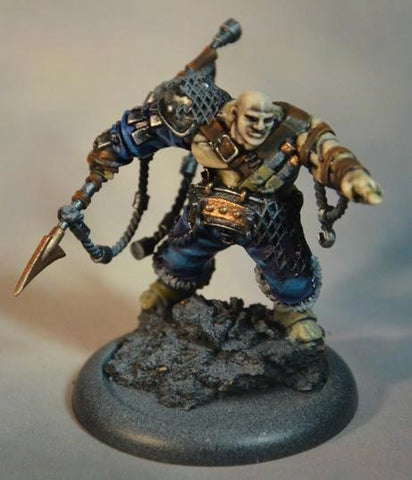
    Fast forward to today and we have an assembled, based, primed Kraken, raring to get paint slapped all over him.

    Guild Ball Model

    Remember Me?

    So what to paint first?

    So, you know how much of a pain in the dick it is to paint those areas that are inside gaps, where you have to dislocate your hand to get the brush in there, and then invariably get paint on some other part you didn’t want paint on?

    Well, I’m too lazy to paint before assembly, so I feel that pain!

    Solution: Paint “inside out”, start with the bottom layer, so in this case, the skin… the work outwards, effectively the outermost layer of clothes will be the last thing.

    I do this to a point… Consistency is the refuge of a weak min… oh look, a squirrel!


    Skin. That was the plan.

    I’m starting with VGA Elf Skintone. It’s a good basis for skin, decent amount of colour, without being too pink, or anything. It’s kinda neutral.

    So, we pour a bit onto our wet palette…

    Now, dilution, that’s a thing. Again, I kinda cheat… If the paint is REALLY thick (like GW foundations) I’ll dilute it with water (regular, everyday tap water).

    To be honest, the game air range is designed to go through an airbrush, so it’s already pretty thin.

    In these instances (prepare to be grossed out) I kinda lick my brush, dip it into the paint, lick it again… through trial and error, I’ve kinda worked out the consistency I like… Spit makes a pretty good surface tension breaker. 

    Effectively you’re looking for a consistency that will “wick” up the bristles. The whole idea is that the bristles hold the paint.

    So people seem to run into a new issue here… you apply diluted paint to model, and get like a “ring of paint around the outside of where you just dabbed it… basically the pigment runs to the furthermost edges. Long story short, there’s too much liquid in your bristles. Wipe that brush on some paper towel and try again.

    You know when you dry brush something, how you wipe your brush until barely any paint is on it? You kinda wanna do that all the time. But because the paint is so diluted, it won’t actually be a dry brush…

    An example… Undiluted paint, out of the pot vs diluted paint ready to be applied.

    Paint swatches

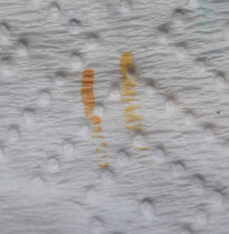
    What I’m trying to do with this is “stain” the surface, if the paint is too thick, you get that “plasticky” looking finish. I want to try and avoid that. It probably won’t happen… But there’s a dream.


    So coat 1 and we have a slightly stained Kraken…

    Guild Ball Model 2

    A couple more coats of the same, and you start to build up a nice base coat. There is nothing wrong with layering on the same colour to increase intensity.

    The added bonus with doing it this way, with really diluted paint, is that you can start to build up highlights, without having to be really neat about it.

    I believe the technique is called “feathering”... Basically take your diluted paint & apply it to the place on the model that it should be the most concentrated. Generally it’s easier to start where the colour should be most intense and work outwards.

    Once the paint is applied, wash out your brush (read: suck it a bit) and then try and (quickly) pull the paint from the edges of where it was applied further out. No need to be smooth / neat, it should be almost transparent here, and straight lines aren’t your friend (the eye is kinda drawn to them). Feather out the edges of your paint, until it starts to blend into the colour around it. 

    Other thing to note, diluted paint looks a lot brighter wet than it does when it dries… So don’t panic too much if it seems really obvious when you first apply it. It’ll all come together a bit once it’s dry.

    So a few coats, building up some highlighted bits, feathering, stuff…

    Guild Ball Model 3

    It’s still blocky, and early days… but you get the idea.


    Shading. 

    So let’s add some shade into this skin.

    Once upon a time, that meant brown inks / devlan mud. Nowadays I kinda like trying to add some colour / interest into my shading.

    Enter, my fav. 3 washes. Secret weapon amethyst (my go to for everything), algae, and drying blood.

    They don’t act the same as GW washes, so aren’t as good for slapping over a whole area for super amounts of contrast, but are amazing for spot colour and shading… I tend to use these a whole lot shading any colour / texture / surface.


    Secret Weapon Washer

    Side note, if you want to shade with a colour, Google “colour wheel” and pick the colour opposite the one you are shading… eg, using purple to shade yellow = works a treat!

    Anyhoo - as mentioned, these still get diluted, and then applied to spot areas, still get feathered a bit, but it’s early days… so being a bit rough and ready can be forgiven, and more importantly, fixed later ;)


    Guild Ball Model 4

    Paint me like one of your french women…

    Guild Ball Model 5

    Did you see that Van Gough?

    Another quick tip… actually one I learned from my father waaaay back in the day, painting model aeroplanes and shiz: When you THINK you’ve finished painting an area / colour / whatever - hold the model upside down and have a look.

    Seems like I miss a spot every. Fucking. Time…

    Also having other judgemental eyes scrutinising your every move helps… even if they are just hoping for Schmackos…


    Dog Needs Treats

    I do not care for your tiny men, I only care for treats

    Ok, so we have got to a point where our model looks like he’s come off second best in a bar fight…

    Next step is to try and make him look a little less beaten up. Basically we go back to our original skin colour (elf flesh) and tone down the shadows. To be honest a lot of my painting goes like this… a little bit too light *shade shade shade*... oops, a little bit too dark *highlight highlight*... This back and forth goes on until you’re happy enough with the result.


    So after a bit more of the flesh colour, we are back here…

    Guild Ball Model 6

    A bit more highlighting with pale flesh and we have some of that contrast back we are looking for.

    Contrast is a thing… These little guys are tiny. To make them stand out you kinda have to bump up the contrast beyond what would seem “normal” or realistic… Darker darks, brighter brights. Like a good laundry powder ad.

    Anyhoo - bit more pale flesh… That’s what we were doing:

    Guild Ball Model 7

    Since most of the shading we have been doing has been “cold” colours… Kraken still seems a bit chilly. I want to bring a bit of warmth back into his skin… Maybe tone down the pink in the pale flesh a little as well.

    With that in mind, a nice dark brown wash… In this case dark sepia. The whole idea is that I just want to tint everything a little. Take some of the edge off… So with that in mind I’m gonna dilute it pretty heavily… Like 2 parts water to 1 part wash. I’m also gonna apply it fairly liberally, since it’s sooo thin, this is pretty safe. Once dry it won’t really seem like we’ve used it. But it should take some of the harshness out of the colours.


    Dark Seapia Paint

    Guild Ball Model 8

    Freshly applied you can see I’ve been pretty heavy handed with it.

    Right. That’ll do for the skin… for now. I wanna come back and do some extra fun stuff later… but that’s a pretty good start.


    Pants.
    Disappointingly they are a fact of life. The next “lowest” thing is the pants and his sleeve. For this, given Kraken is a fisherman, and I’m feeling somewhat unimaginative, I’m sticking with a standard blue theme here…

    Step 1, the base coat. Ultramarine blue...

     Vallejo


    Again, couple of layers is always better than one thick one…

    Guild Ball Model 9

    I’m blue da-ba-dee-ba-da

    Now we go through the highlighting process, this time with electric blue, and the shading process, busting out my ol’ pal amethyst wash again...

    Amethyst

    Guild Ball Model 10

    All over you, electric blue

    It’s right about now I’ve realised I forgot to paint his toes… sigh…

    So I’ll fix the toes at some point… in the meantime, let’s just pretend no one ever noticed it…


    Next step, let’s make a start on the leather and strapping and stuff.

    Queue another favourite, Dark Fleshtone

    Dark Flesh

    This is a great colour as a base for lots of things… skin, leather, umm.. Leather is a kind of skin really, isn’t it? Ok… It’s good for skin.

    Here’s where the whole inside out painting order sorta fails us… So the leather is the next bit “up” from the cloth… except when its over the haft of the harpoon, so I should do that colour first, but that’s under leather on other bits… So no system is perfect.

    Moral of the story here is I’ll mess up at some point and have to go back and fix it.


    Guild Ball Model 11

    Highlighting the leather, I’m using what is clearly another colour I use a whole lot… Parasite brown.

    Parasite Brown Paint

    Yeah, I used this a fair bit...

    Now we could get super technical about where stuff should be highlighted… but again, this guy is for gameplay… let’s not get TOO silly…

    People will be looking at Kraken from the above, probably looking down at an angle of about 45 degrees… so that is a good way to highlight… The brightest bit should be the top… probably towards the front.

    Edge highlighting is something I’m not really using, but the principle kinda still applies.

    So edges of objects in a lot of cases catch light, so end up being the brightest bit. What I don’t want is a hard edge. So I’ll start at the edge, then feather it back towards the middle a bit, to give me a gradual highlight that is brightest at the edge.

    Trick with edge highlighting, both traditionally and blending it further is how you apply the paint. By using the edge of the bristles, not the tip. By using the side of the bristles, you can be sure to just run paint along the edge of a surface without getting a funky jagged line. You don’t have to freehand a straight line, you let the edge of what your painting guide you.

    Other trick (besides the usual, thin paints, not too much on the brush) is how much pressure you apply. The more pressure, the thicker the line. So easy goes it, yeah? Gentle.

    With some highlighting…

    Guild Ball Model 12

    Guild Ball Model 13

    Some more cloth and stuff

    For the base, I’m using Khaki. It’s pretty neutral. Neutral is good…

    If you have some bright, intense colours, adding more super bright intense colours until you have a rainbow means that no matter how well you technically paint something, it will end up looking like a my little pony.

    The way I avoid the browny factor is to pick one major colour, then maybe a spot colour to offset it. The rest of the model I GENERALLY try and keep pretty neutral. Browns, greys, beiges, etc… Thus the khaki. You can add a bit of interest with coloured shading and the like… but keeping it bland makes the main colours stand out.

    Khaki Paint

    Guild Ball Model 14

    So that was a really long winded way to say I slapped some paint on his legwarmers and knife sheaths and shit.

    Gunmetal Grey Paint

    Time for some METAL!!

    I’m gonna take a quick moment to talk about how much I love these metallics… So they’re thin enough to shoot through an airbrush. That means the metallic flake (the sparkly bit) in them needs to be small enough to fit through the tiny ass needle hole in an airbrush. But airbrush, brush, however you apply it, it means NO SPARKLY BITS!

    The thing I really didn’t like about the traditional Vallejo gaim metallics was the kinda “sparkly” finish you got with the metallics… Models ended up looking like they had been hit by glitter.

    Not so with the game air range.

    Apparently the Scale 75 set is also good for this… I haven’t tried them, I cannot comment.

    Base coating some metals.

    Guild Ball Model 15

    Then gonna highlight the gunmetal with some chainmail…

    Chainmetal grey paint

    Just leave the darker gunmetal in the recesses etc…


    Guild Ball Model 16

    Then a final highlight with silver. Apart from the edges / highest bits etc, I like to not highlight ALL the edges… leave some darker bits, it seems to add some depth


    Silver Paint

    Guild Ball Model 17

    We will end up bringing this back a bit with a wash later, so when that’s the plan, it’s generally a good idea to make the highlight brighter than you want the final product… And remember, darker darks, brighter whites…


    Speaking of darker darks. 

     Citadel Foundation Adaptus Battlegrey

    I’m not even sure if they still make this… But it’s good.

    The thing with Adeptus Battlegrey, or any of the GW foundation paints is that they are thick, and there is a LOT of pigment in them. This means it’s safe as houses to really dilute it. You’ll still get awesome coverage, even when there’s more than 50% water to paint.


    I’m mainly using it for the fur around the top of his boots…

    Guild Ball Model 18

    Now a sneaky highlight - enter wolf grey

    wolf grey paint

    Again, I kinda don’t want this to be even / regular. This would even be an opportunity to bring out the ol’ drybrush. Instead, I’m gonna highlight areas though.

    Guild Ball Painted Model 19

     These boots are made for walking...

    Thanks for reading, stay tuned for Part 2.

    If you got something out of it or have any questions please comment below :)